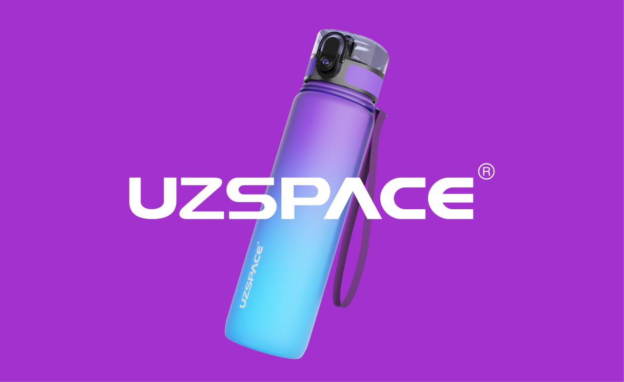
A wordmark built to move as fast as the bottle.
Client
UZSPACE
Year
2025
Scope
The overview
UZSPACE is a sports hydration brand pushing colour-forward, high-performance water bottles into a category ruled by beige. They came to us with a product that already stood out on the shelf — and a logo that didn't.
01 — Challenge
The old mark was polite, thin, and forgettable. On packaging it disappeared into the gradient. On social it looked like a stock font. The bottle deserved better.
02 — Approach
We rebuilt UZSPACE as a wide, muscular wordmark with a custom kinetic 'S' that cuts through the letterforms — a shape that reads like motion, not decoration. Every glyph was redrawn for balance at 12mm on a bottle and at 2000mm on a hoarding.
03 — Outcome
A wordmark that owns the bottle, the box, and the feed. UZSPACE now looks like the challenger it actually is — sharp, confident, unmistakably itself.
By the numbers
+42%
Recall in shelf tests
3wk
Brand rollout
12
Packaging SKUs
More work
Up next
MAYBELLINE →