A construction brand that stops looking like a construction brand.

Client
MASTEROK
Year
2024
Scope
The overview
Masterok is a full-service construction supplier in Uzbekistan. Every competitor in the market used the same yellow-and-black hazard aesthetic. We were asked to build a brand that felt more like a design firm than a hardware yard.
01 — Challenge
Standing out in a category that treats visibility as safety compliance. And doing it without losing the trust-signals a serious construction buyer expects.
02 — Approach
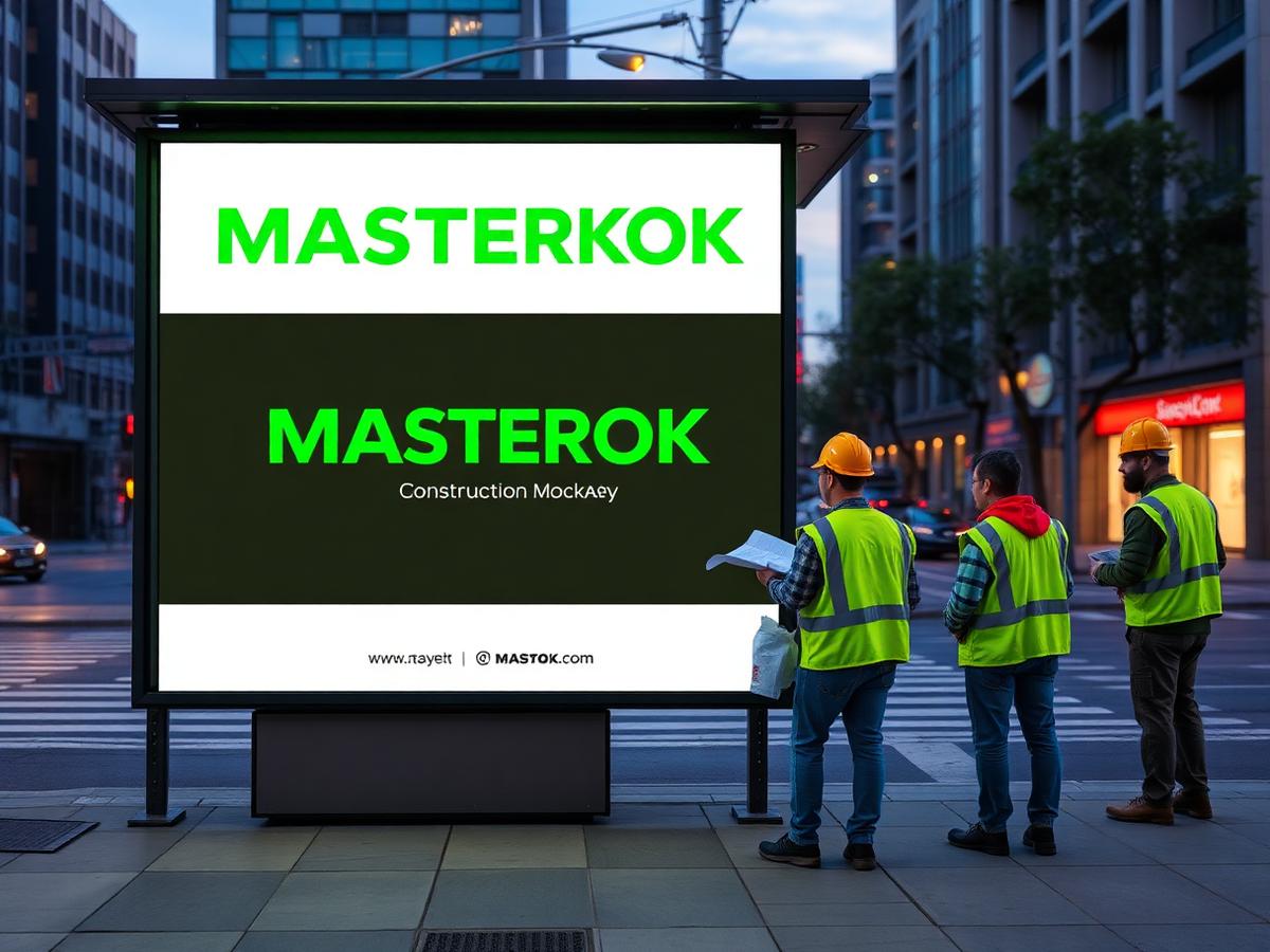
Acid neon-green on deep charcoal, a monospaced wordmark, and a signage system built for scaffolding and bus stops. The palette breaks the category. The typography reassures the buyer.
03 — Outcome
Masterok now runs at industry trade shows looking like an outlier — and their inbound quote requests tripled within two quarters.
By the numbers
3x
Inbound quotes
40+
OOH placements
2 mo.
Rollout
More work
Up next
LIPELLA →