A quiet label for a loud category.
Client
MAYBELLINE
Year
2025
Scope
The overview
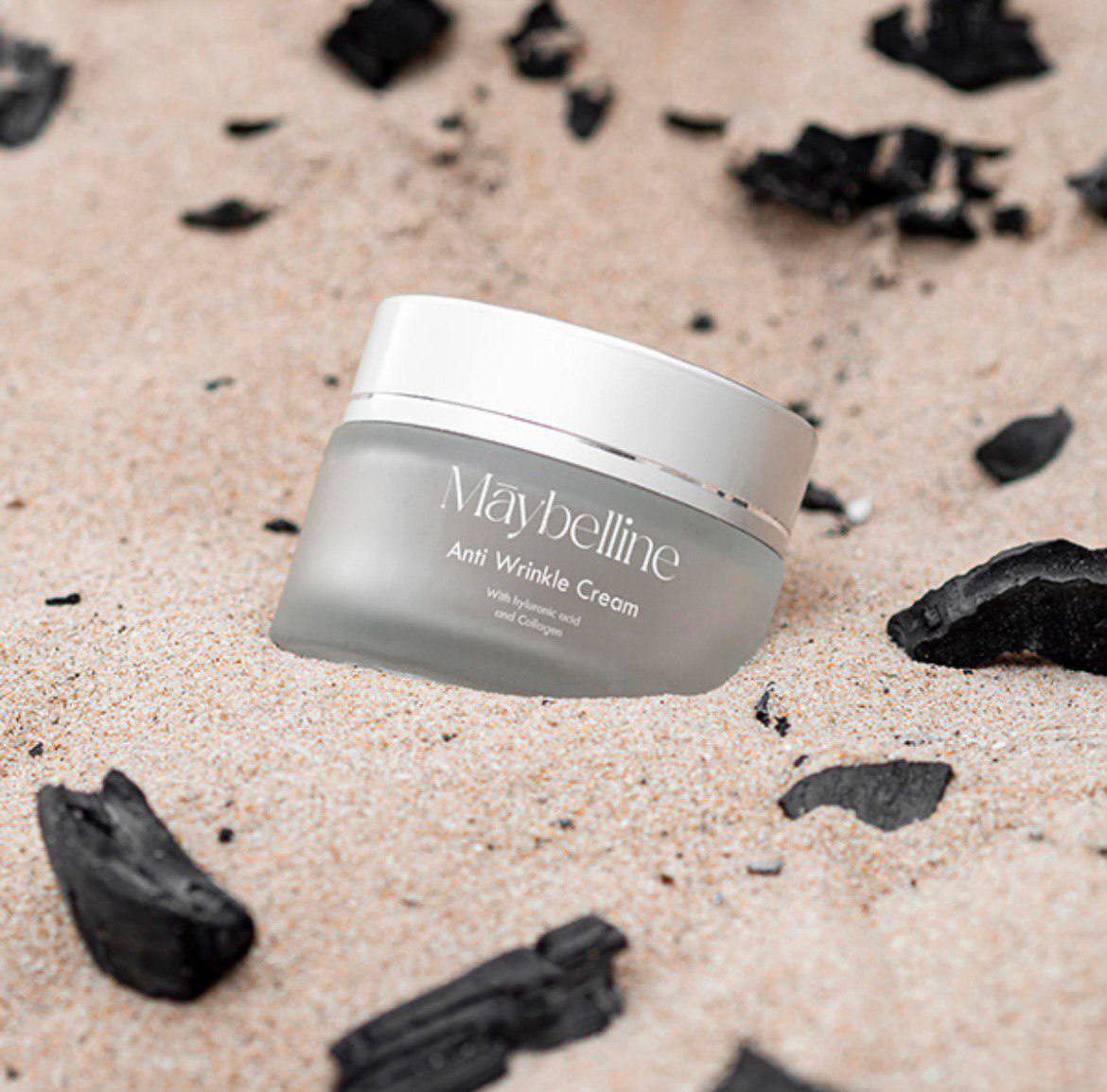
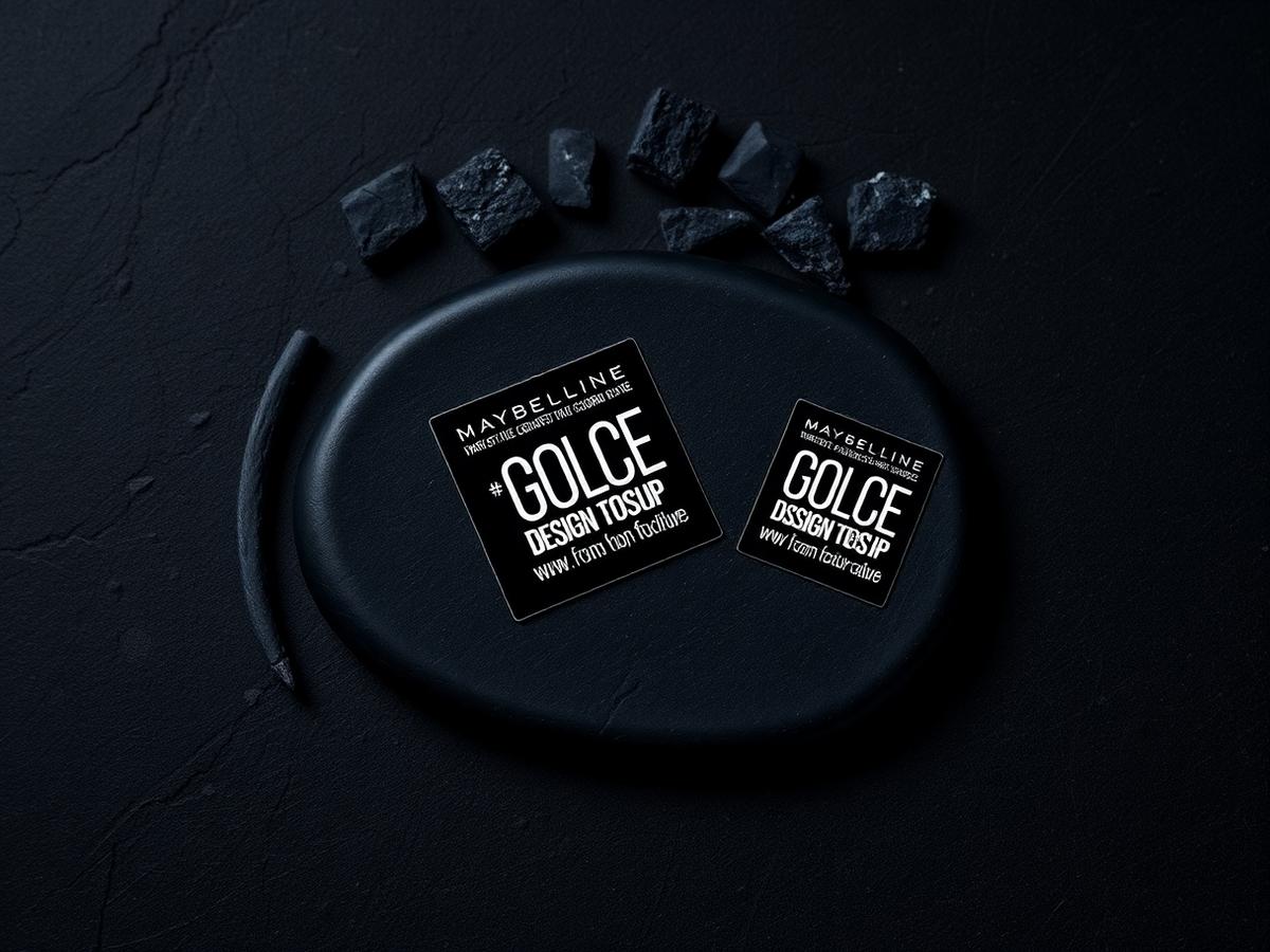
For a limited-run charcoal skincare line, Maybelline needed labels that felt closer to a Berlin apothecary than a drugstore aisle — without losing the mass-market recognition of the parent brand.
01 — Challenge
How do you signal 'premium, mineral, serious' inside a brand system built for stadium-scale beauty campaigns? The label had to earn its place next to €80 competitors while still being unmistakably Maybelline.
02 — Approach
We stripped the label to two ink hits — matte black on soft grey, with a single sharp serif for the product name. Everything else was demoted: ingredient lists shrunk, callouts killed, hierarchy rebuilt from silence up.
03 — Outcome
A range that photographs like editorial and stocks like retail. The line sold through its first drop in eleven days.
By the numbers
11d
Sell-through
6
SKUs designed
2.4x
vs. category CTR
More work
Up next
LUMARE →